Current Account Switch Service
The Current Account Switch Service needed to improve the clarity, usability, and trustworthiness of their website to support millions of users switching bank accounts seamlessly and confidently. They required a responsive, accessible platform that demystified a complex financial process and complied with stringent industry regulations.
Key project challenges
-
Simplifying a complex process
-
Unify business strategy and website messaging
-
Effectively collaborate with content, visual design and development
-
Mature the service's digital presence
My role
-
Lead project strategy and a team comprised of a visual designer, UX researcher, junior UX and copy writer
-
Conduct user research & analyse behavioural insights
-
Principle designer on an intuitive user interface
01.
Delivered a WCAG 2.1 AA-compliant interface, ensuring accessibility for users with visual, motor, and cognitive impairments.
02.
New design system enhancing the expression of the brand.
03.
Clearer navigation and information architecture, getting users to the information they need, efficiently.
Project achievements
My project activities

'We need people to not only understand they can switch their bank account, we need them to know it is easy and could be the right choice.'
1. Audit the current site
The existing Current Account Switch Service site did not meet accessibility standards, was not reflective of the brand and wasn't aligned with the overall strategy for the service. This is why an entire site redesign was required.
Old

New

2. Create a new strategy for the CASS website
-
A presentation summarising the findings of the audit and recommendations for the CASS website
-
A content creation and optimisation plan: this included updating or deleting existing content, creating new content, and optimising content for search engines and user engagement
-
User Experience map highlighting customer needs, existing customer journeys, highlights and pain points
-
Prioritised roadmap to deliver improvements in website / user-experience

3. Understand how banks were communicating
All banks that are part of the switch service explain the process on their own websites. We wanted to review how they do this, because users are more familiar with their own bank’s services; so our experience needed to complement, not compete with, theirs.

4. Develop a new IA
-
Existing IA failed to clearly distinguish between personal and business users, leading to confusion and misdirected journeys at critical decision points.
-
Content was buried within a flat and ambiguous structure, making it difficult for users to find relevant information quickly; particularly when needs diverged between audiences.
We conducted Card testing to assess the revised IA structure. This was further explored in user testing.

5. Create low fidelity wireframes
This allowed us to quickly test assumptions, validate user flows, and align stakeholders around the revised navigation and content hierarchy.
All designs were mobile-first as this is where they experience the most of their traffic.


6. User testing
10 participants were recruited for user testing. The majority of these participants were young - as this was a key market for CASS to communicate with.
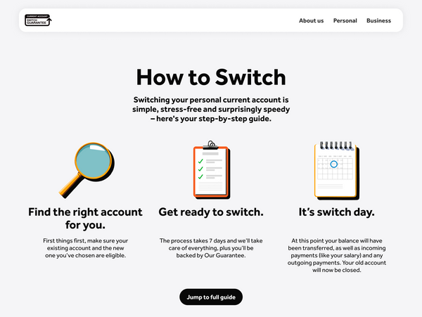
Testing showed an improvement in the navigation of the site, but also a need to focus the content how the process works.
7. Copy & design Iteration
Adjusted designs and copy according to user test results and client feedback. Overall, we needed to make everything sound more neutral, simple, and passive. The content had become too playful and lacked the depth of detail needed.
Multiple rounds with our internal team and client was needed to set the appropriate tone and volume for the content.
8. Accessible design system
We needed to develop a new design system to modernise the visual language, ensure accessibility compliance across all components, and create a scalable foundation that could support future features and content with consistency and efficiency.

9. Close collaboration
I then worked very closely with our visual design director to develop rules and examples on how we wanted the site to animate and move. It was important that the visual design and movement enhanced the experience and reinforced the trust worthiness of the brand.
10. Developer handoff
The final designs were handed off to a third-party development partner. This required a multi layered approach:
-
Annotated designs
-
Consultation with the developers and product team
-
Multiple rounds of UX review
11. Outcome
The redesigned Current Account Switch Service website now offers a clear, trustworthy, and accessible experience that supports millions of users through the account switching process with confidence. By simplifying complex information, enhancing usability, and meeting high regulatory and accessibility standards, the platform is now better equipped to serve both personal and business users at scale.